

‘Sophisticated’ Rebrand: HootSuite Changes Logo for First Time
 HootSuite has changed its logo for the first time since launching six years ago.
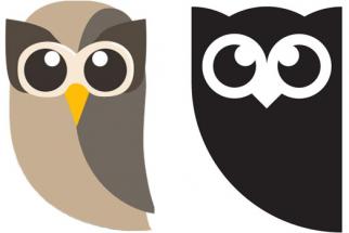
The Vancouver-based social media management platform has turned its mascot, Owly, into a darker and more serious version of itself.
The new logo, which has been in the works for six months, reflects HootSuite’s maturing into a “sophisticated organization” and its growing appeal to enterprises, who now account for more than half of the company’s revenue, according to Dee Anna McPherson, the startup’s vice president of marketing, in The Drum.
SEE ALSO: Ryan Holmes Calls Out Salesforce’s Marc Benioff
The logo is shown in black and white and apparently that’s the final version—no more bright colours or funky outfits which Owly became famous for.
Vancouver-based design agency Vigilantes handled the rebrand.
“We wanted the image to be more grown up without losing any brand equity,” Arndt Klos, head of brand strategy and design at Vigilantes, told Ad Age. “We didn’t want it to be overly corporate. It wasn’t a traditional logo mark, it was more of a mascot. We wanted to be able to dial up level of maturity no matter what audience we were speaking to.”


